WECOME TO MY MIND.
Aspired horror/gore and morbid art photographer. Self-taught aspired MUA/ SFX MUA.

Tuesday, 27 November 2012

Sunday, 25 November 2012

Poor Self Image...

Friday 23rd Novemeber 2012

Plans for the shoot...

The shot I am planning today is going to be the most "emotional" and hold a real message out of all the shoots I have done.

I think poor self image in young people, and some older people too, is a big problem in today's society.  I think it effects loads of people and loads of people struggle on their own.  So today I am going to reflect this in the shoot in my own 'gory' style.

I want the shoot to include the character I create to have a knife and look as if they have hurt themselves by 'carving' or 'engraving' words such as 'fat', 'ugly' and 'worthless' on to themselves.  I also want elements such as tape measures around the waist and half eaten apples etc etc.

I also plan on using the grey background as I like the way the colour can denote emotions such as apathy, upset, depression etc.

What I hope to achieve...

By the end of the shoot, I want to have a set of photos that hold alot of emotion and controversy.  I know this shot is something that will be horrible, but I hope it has a strong message about how society is shaping people and how alot of people actually feel.

What I actually achieved...

I think today I achieved what I wanted to - however, it certainly wasn't the most fun Ihave had in the studio.  Honestly, I found it depressing and it was so serious.  By the end of I just wanted to get out the studio.  I think, in the future if I were to do such a shoot, I would need a model so I can keep focused on the photos more.  I did have 'fun' doing the shoot, but I think working with someone else would have made this shoot much better.

Here are some photos from the shoot...

I this photo as it is much stonger than the rest of the phots that I took.  It sort says to the person looking at it "this is just how it is".  I like this as it makes the character I have created look as if she is fighting society and saying "this is what you have done".  Through-out the shoot I went with a very in with a state of mind of wanting to creating a shy, weak and timid character who is ashamed of what they are - I like how this photo has contradicted my first ideas yet I still think it works well.

I like the pose in this photo and the angle of the face, I also like how you can see all the 'writing' here too.  I am not as fond of the facial expression here though, I don't think it is strong enough to compliment that concept of the shoot.

However, one other little thing I like about the shot is the positionig of the props e.g. the knife is reflecting the light, the apple is seen clearly and the tape measures are separated out against my body - they kept falling down every 2 minutes!

This is my favourite photography from the shoot I did today.  This shot wouldn't have happened if it wasn't for a lucky mishap in the studio where one of my flash lights didn't go off - I went to look at the photo and loved the effect!  So I kept it off for the marjoity of the shoot after that!

I love the lighting and the way this has added to the emotional depth of the photo.  I also like the lost "given up" expression.  I am especially happy with this as I got the reflection of the light in the knife in the photo - this was something I was struggling to do and in some shots it made the knife look fake and plastic.  Here it looks real (as it is) and I think this adds to the danger and horror of what I am portraying about society.
This shot is a little different and I like it.

I love the lighting and the way you can only see parts of the 'writing' in the shot - it makes the person looking at the photo look around the photo more to really see it.  I also like the pose and the facial expression.

I like how the kife is also the closest thing to the light here and how it really relfects the light in this shot.  I think this has accentuated it this highlights what I am trying to say and the message I wanted this shoot to have.  I also like how on the other are you can just about see the 'writing' and the apple.  I love how half of my face here is in darkness too - I really love this type of lighting and want to do it other shoots I think.
I like the light in this photo and the pose.  I think it gives off emotions that portray what I am trying to say about how society makes some people feel.

I also like the way I cropped this one so you can only see the characters faces and the word 'worthless' - I think it gives a slightly different feel to the other photos.
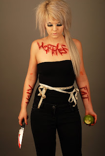
This shot is very similar to the first shot that I have put on this blog post, only here I am looking down in the photo.  I like this as it holds emotion that I originally went in wanting to capture (giving up, sadness, weakness, feeling inadequate etc.) and this contrasts nicely with the first photo that is much stronger in the pose and the emotion it has.  This shows two sides to what I am shooting.  I also like how I have got the reflection of the light in the knife here again.
What I am going to do next...

This shoot has inspired me to want to photograph other issues in society that effect people in horrible ways etc.  I love the controversy this shoot had in the message and the way I chose to photograph it.  I think possible a shoot about drugs or drinking abuse, or even something like teen pregnacy or child abuse might be possible things I would like to explore.

Also, I have learned alot about light in this shoot and it's importance and they way it can change/ effect a photo.  I want to try out some more shots where I work with the light differently to help me get better shots.

Sugar Skull!

Tuesday 20th November 2012

Plans for the shoot...

Ok, second shoot for today!
I am planning on doing myself up in sugar skull makeup for a self-portrait shot.  I am planning the theme of the shoot around "love is dead" or "dead valentines" or something like that.

I want the shoot to be very elegant and classy like, but then I want there to be the gory element of having my neck slashed open.  I also want to use red roses through-out the shoot in different ways on the look I will create and for extra things in the shoot.

What I hope to achieve...

Once I have done the shoot, I hope to achieve some photos that show both the contrasting elements of my shoot that see a elegant and a gory side.

I want the shoot to really highlight the sugar skull makeup well and for this to be the focal point with the slashed neck, and for everything else in the shot to be subtle.

What I actually achieved...

Today's shoot was so fun! I really enjoyed creating the character that I did and shoot it in the studio.  I liked the angle that I took with the shoot and I think the photos I have ended up with are pretty good.

I did need some help in parts with adding some elements to my shoot such as getting a friend to throw petals over me, but other than this I found the shoot relitively easy and, as mentioned, so much fun!

Here are some shots from the shoot that I like...


Here is one of the shots I really like.  I like this shot as I think it has alot of emtion in it - the way the character is looking up at the rose is denoting love or passion, yet there is still death and danger here with the way the neck has been slashed open.  I also really like how background compliment this pose and the charatcer in this particualr picture.


This is another photo I really happy with - again, I like the emtion is holds.  This is also one of the photos that I cropped down and I prefer the effect this has given.  I like how this photo really focuses on the face as everything is pointing to it using the colour and even the rose being put toward the face.  This accentuates the character being the focal point and I think makes the perswon looking at the photo see more emtion on the characters face.

 I really like the idea of this photo with the petals falling over the character.  However, out of the the shots I tried to get of this, I still couldn't quite get it how I wanted it.  It proved to be very difficult to get the timing of throwing the petals right and I had to have a friend standing on a ladded to the side of me while we tried endless times to get the shot.

I think this shot is OK, but I am not happy with how the character looks (I think she looks awkward and you can tell that she is concentrating) and I would have liked the petals to be more scattered over the chaarcter as they fell.
 I really liked this shots simply because I thought it was different.  I like the pose and the slightly different emtion I think this photo holds.  I think it makes the character look stonger and more incontrol - almost a little intimidating.

I also, again, really, like the grey background here.  I think it compliments the red nicely and makes in stand out more.
 This is one of the close up shots that I got.  I really love this one as you can see the character really well e.g. the makeup  and the cut.  I also like this as it is different - it reminds me of a glamour shot that should be all perfect and pretty, yet it is anything but that!  I think this is good think as it adds more contrasting elements.

Finally, here is a full body shot that I got.  I am really happy with this photo.  I like the elegence this photo has and the pose of the character.  The only thing I don't like about (I say this with most of my body shots) is the shadows!  There isn't many in the photo, but I would have liked them not to be there.  I also don't like the way you cannot see the cut very well from the angle and distance and I think this makes the photo loose some of its purpose and what it is saying.


What I am going to do next...

I had fun witth this shoot and creating the charater, it is probably the most fun I have had in the studio yet!

From this shoot though, I think I want to do something in which I create a charatcer and have something being thrown over them (like the petals) as this was a shot I really wanted to get perfect, but now I know it takes practice! 

I also like the idea of doing 'ugly' or gory glamour shots like what I though of about with the fifth photo I talked about.  I like the contrast this would have and again, it would be something different I could have fun with.

Friday, 23 November 2012

Poor Self Image

Poor self image is something that I think loads of people in today's society struggle with for various different reasons.  So today I decided to a shoot that reflected this subject, only I decided to do my own 'gorier' version of it.  Here's a few shots from the shoot! - Hope you like it!


Wednesday, 21 November 2012

Corpse Paint Shoot!

Tuesday 20th November 2012

Plans for the shoot...

Ok, so today I am planning to get my friend Pandora and do her up in corpse paint and black metal fashion!  I am really excited for this shoot and am glad that I have finally found a willing model that will let me cover them in crazy makeup in college!

I think I am going to use the red background in the studio as I plan for her to be in only black and white (these colours are essential for the look, and are pretty much a 'black metal-heads' wear).  I also like what the colour red can suggest/ connote for the bakc ground such as danger, Satan/ the devil, blood, gore etc.

What I hope to achieve...

I am hoping to get a good selection of shots from this shoot that show the dark side of black metal music.  I want the photos too look 'scary' in a way, but mostly I want them to focus on the corpse paint and the black metal aspect (most people find this kind of thing 'scary' anyway).  I am hoping to get be able to get my model to really push the emotion out in the look and capture this in the photo.  I want it too look passionate in terms of the black metal culture.

What I actually achieved...

That was one of the most enjoyable shoots I have ever done!  I really enojyed working with a friend and this made me more passionate about my work.  I am also really happy with the photos too.

Admittedly I did have some struggles in the studio at first with the camera and the flash, but I was soon able to sort this out.  And something that I have learned is that when doing a shoot like this I must be very respectful of the person in front of the camera and make them feel comfortable and not pressured.  I don't like being in front of the camera myself and I must remember this when shooting others.

Here are some of my best photos from this shoot...


I love this photo! - I really like the seriousness and the way that Pandora is the main subject here.  You can really see the paint and I love the way everything is contrasting with the background.  I think this looks like a real black metal-head with the serious, almost subtly threatening look.


Another shot I absolutly love! I really like this one for the expression and the way everything looks so "I don't care" with the messy hair and the way the pose it pushed toward the camera.  I like the way I stepped forward into this shot and the way Pandora pushed her upper body out accentuate this - I think it adds to the "threatening" side of the look and the whole "individualiy stand".  I also like the light here and the way the shadows fall on her arms - it's like all light in the foreground on her face and neck, but her arms are going down into shadow.  I like this effect and think it adds to the look.


I really like this photo alot! - apart from all the shadows! The pose and energy is perfect and I love the whole crazy thing that's going on here, but the shadows just sort of spoil it!

I think with the shadows there is too much black and darkness in the photo - it really needed that red background and it is a shame so many shadows were cast.

I really struggled to minimise the shadows in these full body shots and it is something I will be more wary of in future shoots.


 Fianlly, I really like these two shots.  I like them because they are different and I like the angle at which her face is.  I also like the feel and emotion these photos have - they are slightly softer and this contrasts with the makeup/ look and idea of the shoot.


What I am going to do next...

This shoot has given some inspiration to look at other exstream sterotypes in music and fashion.

It has also made me think about doing something like a "Corpse Bride" shoot or even doing a shoot with a corpse (obviously not a real one) but this is something I would like to have a think on and plan out.

 
(MASSIVE thank you to Pandora for modeling for me in this shoot! xxx)

Friday, 16 November 2012

Just a few ideas...

OK, so next week I decided to book the studio out three times to get some of my ideas down and photographed!

The first idea I have had is involving my friend Pandora and shooting her done up in corpse paint.  I got inspiration of this idea through the black metal music I like to listen to and the extreme culture and fashion that surrounds it.  I think the fashion, and mainly the 'corpse paint' that the 'metal heads' wear is inspiring and so different - I love it!


These are some photos that I found on Google that I quite liked for inspiration.  I like how the first and third photos are really true kvlt black metal style, and how the other two are in a slightly more editorial style.  I think I would like to try out both ways of shooting this look.

I intend to shoot this on Tuesday 20th November 2012.


Another idea I have had is based around my hatred for Valentines days.  I see no point in the occasion and want to do a shoot based around "Valentines is dead".  For this shoot I really want to see what I can do with an extravagant makeup look involving sugar skull art.  I want the shoot to be all "roses and hearts" and then my face to be done up in sugar skull to contrast the look.

Here are some photos for inspiration:


I also had an idea to develop this idea further; I thought about getting a couple and shooting them wearing gas masks in wedding outfits or something - depending on how this shoot goes on Tuesday 20th November 2012, I may look at developing it in this way too.

Thursday, 15 November 2012

"Dead Doll Shoot"

Tuesday 13th November 2012

Plans for the shoot...

For today's shoot, I am hoping to be able to do a shoot in the studio in which I will be dressed up as some kind of "dead doll" using SFX makeup.  I want to capture an array of different shots in which I will capture the character I create in weird, almost broken positions (as if the strings on a marionette doll have been cut).  I want to capture the creepiness and the eeriness in the shot through the makeup and facial expressions I chose to do.

This shoot is an developed idea of the shoot that I did previously in which I hung some dolls and then myself - not literally.

What I hope to achieve...

The thing I want to achieve most in this shoot is a really creepy photo - I want my work to be something different that will get people talking.

However, other than this I want to illustrate a message too (I don't just want it to be completely for fun and completely for the creepy photo).  Seeing as I originally got the the idea of this shoot through some old abandoned toy dolls I found in the studio, I think the message I am trying to get across is that childhood is dead - or over quickly.  Dolls, and other old toys like it, aren't appreciated as much as what they were with children growing up so quickly and with new technology, so I would like part of the shoot to reflect this too.

I also really want to make an animate out of some of photos and would to try and do this in this shoot.

What I actually achieved...

OK, that shoot was by far the best one I have done to date!  I had so much fun creating the character and shooting!

By the end of it I achieved a good range of photos that I am happy with.  I also feel by the end of it I am much more comfortable in the studio and about using myself in a shoot - something I hated the thought of doing before.

Here are a range of photo that I particularly like from the shoot.


This is probably my favourite shot of the day!  I like it as I think I have really captured the eerie and nightmarish look that I wanted.  I am also really happy that I chose to shoot on the blue background (originally I was going to shoot on the grey background) but seeing as I was wearing on black and white on the costume I really wanted it to stand out.  The only colour on the look was the pink on my lips and the SFX blood I used on the scars and these colours contrasted great against the blue background too.


This is another photo that I really like as my body looks kind of broken like a marionette doll's strings have been cut.  I also like the way the creepiness is added with only my eyes directing the camera.  I would have liked to get some more photos in different poses like this, but I found it very difficult.


This is another photo I quite like.  I like this one as you can really see the makeup on my face the SXF scars/ cuts I created.  I think this is good as it highlights the main elements of the photo shoot.  I also like how my eyes look really glasses and doll-like here.  I would have liked to get some more shots of my face closer up so you could really see the makeup as this was one of the key things in the shot.  However, I like here how I have captured the outfit.


Finally, I used the following four shots to create the animation I made (see previous post).  I am really happy with the animation and would love to try out other things using this now!


What I am doing next...

I don't think I will develop this specific idea any further, however, I am definitely going to continue my shoots based around horror/gore ideas that have a deeper message.
I would really like to do something with corpse paint and sugar skull makeup and have ideas for these both.  I also want to do a shoot in which I cover myself in writing that has some kind of message about my views on society.

Tuesday, 13 November 2012

Dead Doll Animation

Photobucket 


This is what I did today! - covered myself in SFX makeup and made an animation out of it! haha. ;)