WECOME TO MY MIND.
Aspired horror/gore and morbid art photographer. Self-taught aspired MUA/ SFX MUA.
Aspired horror/gore and morbid art photographer. Self-taught aspired MUA/ SFX MUA.
Tuesday, 18 December 2012
Don't bite off more than you can chew!
Friday 14th Decemeber 2012
Plans for shoot...
For today's shoot I am planning on taking the inspiration from something a friend said to me about the amount of work/ college work I do and trying to stay on top of it all! - they said, "don't bite off more than you can chew".
This instigated the idea for the shoot in which I am bite off my arm.
To do this shoot I am going to be using some makeup, but also looking at doing some Photoshop work on the photo as I haven't done much of this yet.
What I hope to achieve...
From this shoot I hope to be able to display the saying that I am basing my shoot around in a style that reflects my work.
What I actually achieved...
Today's shoot went well I think, though I experience a lot of development during the actual shoot itself today in order to get the best possible photo I could.
The first problem I encountered that I needed to change was the actual composition of the shoot and where I was doing the makeup on my arm - orignally it was going to be done on my lower arm, but you could see it this way. So instesd I move the makeup up to my upper arm and this work much better. However, I then I had the problem of fitting my entire arm in the shot without making it look weird or making it look out of place and not being about to see the makeup and what was going on in the shot.
After experimenting with various different positionings and lightening, I decided I liked best shots taken from above. I also really like the photos where the shot was zoomed right in - you could see the detail better and it provided me with more space to work on the cuts and bites on Photoshop. Here is the finished piece...
Here is the photo. To get the bruises and to help me with some of the bloody effects I used some of teh stuff available to Photoshop such as the burn tool and the paint brushes set to a low opacity for the bruises, and then I used the blur tool slightly. For the blood, I just downloaded the blood brushes for Photoshop.
What I am going to do next....
This shoot has made me want to look at doing some more Photoshop work so I can become even more confident with the programme, however, I defaintely prefer to just do the makeup myself prior to a shoot - it is much more fun and I feel like I have got more accomplished. I feel here that I have almost cheated with my work.
Monday, 17 December 2012
Half skin, half bones
Tuesday 11th Decemeber 2012
Plans for the shoot...
For today's shoot I am planning to do a makeup look in which the upper half of my face is done in 'flawless' full makeup, and the lower half of my face is done up like a skeleton which is divided by a cut in the middle of my face. I think I am going to use the grey background for this shoot.
This shoot idea has simply insigated by the makeup look that I have thought up in my head, so I guess it holds no real message. However, I think the look could be interpruated in many different ways and hold different messages to different people who look at it. I like the thought of someone looking at my work, and even if it is only vague connection, they can relate it to themselves. For example, I think that this shoot could be related to people not being able to speak out and have a say or voice their opinion, or if they do feel they are not being heard or something. It could also relate to people with some kind of eating disorder (the fact I am making the entire mouth area look like bones) - these ideas might be far fetched, but who knows.
What I hope to achieve...
From this shoot I am hoping to get some photos that show the makeup well, but also show some kind of deep emotion in the eyes. I really want the eyes of the subject to connect with the camera here - I think this will help the audience see a deeper side to the shoot and suggest that it could actually hold a deeper message to some people.
What I actually achieved...
I am really happy with how this shoot turned out. I think the photos hold a deeper emotion in the eyes like I wanted, but at first glance look like I am just photographing makeup. Here are some of my favourites...
I think this is my favourite photo. I like how the shot is off center slightly, and how the strong pose contradicts the more vulnerable eyes. I reallyl like the lightening and how the backgorund turned out in this shoot - I find the grey background works well with alot of my work. The subject here is the focal point and the audience can really connnect with the character as they are looking straight into the camera - I think this helps to channel the emotion.
This is another photo thaI like that I think is very similar to the first photo. I think the emotio in the eyes here is alot stronger, and the pose ever so slightly weak - I think the way the shoulder is exposed is making the character look more exposed and vulnerable.
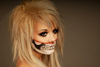
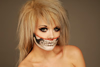 I like the differences these two photos have in terms of emotion - the right one looks very distant and diconnected from the photo and the audience where was the one on the left is very enganging and the pose is forward and slightly leant toward the audience.
Plans for the shoot...
For today's shoot I am planning to do a makeup look in which the upper half of my face is done in 'flawless' full makeup, and the lower half of my face is done up like a skeleton which is divided by a cut in the middle of my face. I think I am going to use the grey background for this shoot.
This shoot idea has simply insigated by the makeup look that I have thought up in my head, so I guess it holds no real message. However, I think the look could be interpruated in many different ways and hold different messages to different people who look at it. I like the thought of someone looking at my work, and even if it is only vague connection, they can relate it to themselves. For example, I think that this shoot could be related to people not being able to speak out and have a say or voice their opinion, or if they do feel they are not being heard or something. It could also relate to people with some kind of eating disorder (the fact I am making the entire mouth area look like bones) - these ideas might be far fetched, but who knows.
What I hope to achieve...
From this shoot I am hoping to get some photos that show the makeup well, but also show some kind of deep emotion in the eyes. I really want the eyes of the subject to connect with the camera here - I think this will help the audience see a deeper side to the shoot and suggest that it could actually hold a deeper message to some people.
What I actually achieved...
I am really happy with how this shoot turned out. I think the photos hold a deeper emotion in the eyes like I wanted, but at first glance look like I am just photographing makeup. Here are some of my favourites...
I think this is my favourite photo. I like how the shot is off center slightly, and how the strong pose contradicts the more vulnerable eyes. I reallyl like the lightening and how the backgorund turned out in this shoot - I find the grey background works well with alot of my work. The subject here is the focal point and the audience can really connnect with the character as they are looking straight into the camera - I think this helps to channel the emotion.
This is another photo thaI like that I think is very similar to the first photo. I think the emotio in the eyes here is alot stronger, and the pose ever so slightly weak - I think the way the shoulder is exposed is making the character look more exposed and vulnerable.

 I like the differences these two photos have in terms of emotion - the right one looks very distant and diconnected from the photo and the audience where was the one on the left is very enganging and the pose is forward and slightly leant toward the audience.
I also tried out the blue backgorund for a couple shots to just to shee what it looked like. I really like this too as it makes the makeup stand out more. I also like the pose and positioning in this shot.
What I am going to do next...
From this shoot I have that I think I quite like working with photographing makeup (obviously I knew that anyways but yeah) but I like capturing the emotion and possible hidden message that a subject might hold. This shoot has also inspired me too perhaps look a more skeleton related shoots.
When in the studio... a guide for dummies!
Okay, so I basically abuse the use of the studio and am in it 24/7. However, despite how much I am in there, I only just learnt the other all the technical stuff that needs to be done prior to a shoot, and thought it might be nice to share this on here for everyone to see. :) (Sorry if there are technical terms lacking! I will edit this when I totally figure it all out!)
Okay, step one - the camera!
Make sure your camera has batteries first (nothing more annoying than it not having them)! And you also need to format the camera. Now, when I spent god knows how long trying to figure this out, it really is like the easiest bit about setting the camera up! On the back of the camera you will find two buttons that are different from all the rest; this is because next to these two buttons there is the work FORMAT written in big red capital letters. All you need to do is hold these down together at the same time and the screen on the camera will flash and the display will change. Release the buttons and then press them again and you will have a formated camera, simple!
Then you need to set the camera up accordingly, but first...
Your set needs to be sorted. Pick you backdrop or whatever you are using in the background and then set up you flash lights - these need be directly on your subject.
Step two - flash and camera settings!
For this step you need to use the light reader and the flash clicker thingy that goes on top of the camera. Once the flash lights are turned on, stand where your subject will be standing for the shoot holding the light reader in on hand with the front of it (the side with all the buttons on it) facing the camera, and hold the clicker thing in the other hand. Now, you need to HOLD DOWN the top button on the side of the light reader, press the button on the clicker thingy (the flash should go off) and the RELEASE the button on the light reader. Do this a couple times for accuracy and then read the number you get on the screen. This number now needs to correspond with the 'F' setting on the camera (this is the number located on the far left of the camera screen) - to change this simpley move the dial on the front of the camera.
Okay, if you're still following this, you now need to change the iso number and make sure it is set to 200. To change this, all you need to do is go on to the camera meun and it is pretty self explanatory.
Now, you need to make sure the shutter speed is all good too - it should be set to 100 for a normal shot. To change this all you need to do is move the dial at the back of the camera on the right hand side (just like how you did for the 'F' setting previously).
If you require self timer for your shoot, you can do this via the dial on the left hand side of the camera turn it right to the end of the wheel till you reach the picture of the alarm clock. If you need to change the time set to this, you can do this in the camera settings on the menu (again, this is pretty self explanatory).
Hmmm, I think that is everything... I think!
Good luck with your shoots and have fun in the studio!
(Sorry for any mistakes, and I will try to edit technical terms in asap!)
Saturday, 8 December 2012
Blood Stained Valentine
Tuesday 4th Decemeber 2012
Plans for the shoot...
Okay, so this shoot idea has been inspired by my previous sugar skull shoot - I liked the whole 'love is dead' etc. theme.
In this shoot I plan to make it much more gorey though! I am planning on getting a REAL pigs heart, or any type of similar animal and making it look like I have had my heart ripped out. I am also going to create a bakcground that is white and covered in blood splats. I am really looking forward to this shoot!
Because I cannot get a model for this shoot, I plan to do it myself - however, because I am goign to be COVERED in blood and stuff, I am going to get a a friend to help me with my photos though I will be conducting and directing the entire shoot.
What I hope to achieve...
I am hoping to get some photos that can show the message I am getting across, that I guess is essentially about broken hearts and all that. I want it again to be something rather contraversial though, as the gore element here is pretty dominate in the shoot.
What I actually achieved...
Today's shoot was so fun! However, one thing I definately didn't like about it was the whole 'directing' thing and not being about to use the camera myself. I am in desparate need of willing models as this is something I would never do again. I felt that I was checking every photo and just not happy during the shoot because I didn't physically push the button - I am also not the best of models and this made me more agitated. Also, I smelled so bad after this shoot!
Still though, I am happy with the shoot - it was fun - and think I got some pretty good photos from it...
Here are three photos that I really liked form the shoot. I like the different expressions and the different emtions they give. I like how in all of the there is the slightly werid element of it looking like I am enjoying the fact my heart has been ripped out. I like how here the heart is seen as something for desire that can be hurt, and I think this gets across the whole heart broken, Valentines is dead theme in a more contraversial way.
I really like the intensity in these photos and how they portray a different emotion to the rest. They almost look angery and a little bit 'physco'.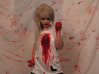

I love this photo alot! I like the focus on the heart and the way you can see the chest all ripped open or whatever. I think this photo is more powerful than the rest and makes much more of a statement. I also love the colour contrast here with the red and the white and the way you can really see the heart and that it is real.
This photo looks threatening and it is very very different to the rest. I like the connetion the eyes seem to have with the camera here and the focus this draws.
This photo on the other hand is the complete opposite - it looks more hurt and 'innocent'.
I really love how in one shoot the angle and message I was going for has been brought out in so many different ways.
Finally there are these photos. They look so creepy as if I am actually eating the heart. There is some kind of defeatedness about the character here too that I think is because there is no contact with the eyes and the camera - the character here looks lost in its own world. I like the way the heart is the main focus in these photos as this in accentuated here, I think, with the character looking weaker and more vunerable,as if the heart is drawing them in.
What I am going to do next...
I am not sure ifI am going to develop this idea any further. However, this shoot has definately made me want to continue to go all out in my shoots and have no limits. It has also made me realise how much I need more willing models to help me out with my shoots - this something I am going to get to work on asap!
Friday, 7 December 2012
The Anti-Christ is Born...
Tuesday 4th December 2012
Plans for the shoot...
I am really looking forward to this shoot as I actually have a willing model for a change! The idea behind this literally comes from something I just found myself thinking about randomly, but, when analysing the thought and planning the shoot it resembles the bible in some ways - this wasn't done intentionally, but I am happy with the link it possesses.
So, the shoot idea is to have my model pose looking all gored up and zombie like with a crown of thorns on his head. I want there to be loads of blood and horror elements in this shoot.
What I hope to achieve...
From this shoot I really want to get a set of photos that have the gore elements that I love working with. I want there to be controversy too.
What I actually achieved...
Today's shoot was so fun and it was great actually getting to work with a someone else to model who took it seriously. I am so happy with how the photos have turned out and I think they are really good. I also like the idea behind the shoot and, as said before, loved working with a model as opposed to myself. I felt I could focus much more as I wasn't worrying what I was looking like in the shot etc. I also like how the character created was one in which I could portray a message in a different way.
Here are some of my favourite photos from that shoot...
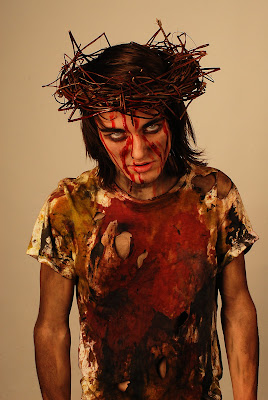
This is my favourite photo from the shoot today - it illustrates perfectly what I wanted it too.
I love the pose and the intensity that this photo has the strong emotions that it brings across. It looks threatening and I like the way the makeup/ character designed has been executed. I think the white background has really added to the over all effect of the photo too e.g. white connotes innocents and purity and this photo is anything but that bringing in elements of contrast. It also makes the main focus on the subject and I like this in my work.
This another photo that I really liked. I love the intensity it has and the creepiness that it has too. I like the way this shot you can really see the eyes as I think they eyes hold most emotion.
This is also a photo I cropped out slightly as there was originally more of the arms in the shot but I think that by cropping it down slightly it has brought even more focus to the subject and makes it look a lot tidier.
These are some more photos that I particularly like using the 'twigs' (or whatever they are). I really like this first one - it reminds me of Joey Jordison (not that is particularly relevant to the shoot, but still). I like the side profile shot as it different to the rest and it holds different emotions - this one is less angry and threatening and more soft as if the character has been beaten and that's that. I think this photo is a nice contrast to the rest.
I like the light and dark contrast in this photo. I think by doing this you are seeing two sides to the 'story'.
I really love how the light has highlighted my models bone structure in this shot too and how the eyes look so different.
The pose in this photo is really different but I think it works for the character and what I wanted for the shoot. I like how even though this photo is busier as there is more going on with the pose the emotion and focus on the eyes is not lost. I like the way it seems as if the person looking at the photo is being reached out to here.
The final photo I have chosen is this one - eyes!
This photo is very strong and I think it really shows the anger and the threat. I like how you cannot see everything going on in this shot and focus and attention the eyes have.
What I am going to do next...
I really loved this shoot and how it turned out. Though it happened by accident, this shoot as inspired my to look at doing more shoots to do with religion or belief. These are things that fascinate me and something I think I could really go all out with. It also is something that could be very controversial and something that I could incorporate a lot of horror and gore elements.
Plans for the shoot...
I am really looking forward to this shoot as I actually have a willing model for a change! The idea behind this literally comes from something I just found myself thinking about randomly, but, when analysing the thought and planning the shoot it resembles the bible in some ways - this wasn't done intentionally, but I am happy with the link it possesses.
So, the shoot idea is to have my model pose looking all gored up and zombie like with a crown of thorns on his head. I want there to be loads of blood and horror elements in this shoot.
What I hope to achieve...
From this shoot I really want to get a set of photos that have the gore elements that I love working with. I want there to be controversy too.
What I actually achieved...
Today's shoot was so fun and it was great actually getting to work with a someone else to model who took it seriously. I am so happy with how the photos have turned out and I think they are really good. I also like the idea behind the shoot and, as said before, loved working with a model as opposed to myself. I felt I could focus much more as I wasn't worrying what I was looking like in the shot etc. I also like how the character created was one in which I could portray a message in a different way.
Here are some of my favourite photos from that shoot...

This is my favourite photo from the shoot today - it illustrates perfectly what I wanted it too.
I love the pose and the intensity that this photo has the strong emotions that it brings across. It looks threatening and I like the way the makeup/ character designed has been executed. I think the white background has really added to the over all effect of the photo too e.g. white connotes innocents and purity and this photo is anything but that bringing in elements of contrast. It also makes the main focus on the subject and I like this in my work.
This another photo that I really liked. I love the intensity it has and the creepiness that it has too. I like the way this shot you can really see the eyes as I think they eyes hold most emotion.
This is also a photo I cropped out slightly as there was originally more of the arms in the shot but I think that by cropping it down slightly it has brought even more focus to the subject and makes it look a lot tidier.
These are some more photos that I particularly like using the 'twigs' (or whatever they are). I really like this first one - it reminds me of Joey Jordison (not that is particularly relevant to the shoot, but still). I like the side profile shot as it different to the rest and it holds different emotions - this one is less angry and threatening and more soft as if the character has been beaten and that's that. I think this photo is a nice contrast to the rest.
This other photo is very different too as you don't see the models face. I like how here you can see the object causing the 'death' and hurt in the shot. Again, I feel this photo gives a different message and shows the character in a different light.
I like the light and dark contrast in this photo. I think by doing this you are seeing two sides to the 'story'.
I really love how the light has highlighted my models bone structure in this shot too and how the eyes look so different.
The pose in this photo is really different but I think it works for the character and what I wanted for the shoot. I like how even though this photo is busier as there is more going on with the pose the emotion and focus on the eyes is not lost. I like the way it seems as if the person looking at the photo is being reached out to here.
The final photo I have chosen is this one - eyes!
This photo is very strong and I think it really shows the anger and the threat. I like how you cannot see everything going on in this shot and focus and attention the eyes have.
What I am going to do next...
I really loved this shoot and how it turned out. Though it happened by accident, this shoot as inspired my to look at doing more shoots to do with religion or belief. These are things that fascinate me and something I think I could really go all out with. It also is something that could be very controversial and something that I could incorporate a lot of horror and gore elements.
Welcome to my Wonderland
Friday 30th Novemeber 2012
Plans for the shoot...
So, today's shoot I was inspired by the one and only Wonderland (yes, Alice).
It's a little different to what I normally go for in my work, but I love Alice in Wonderland and seems like a cool idea. I am planning on this time, rather than focusing on makeup, I will wear a rabbit mask and cover it in blood, and then wear a bloody t-shirt too. I am also wanting to hold a sign that syas "WELCOME TO WONDERLAND BITCH" as I want it to be dark and dangerous.
What I hope to achieve...
Out of today's shoot I really want to get a set of photos that show the dark side to Wonderland - like the dream has become a creepy nightmare. I want it to portray Wonderland as being a unsfae place filled with bad things rather than the typical chaotic madness that is seen in a light-hearted way - I think the rabbit is the perfect character to do this with as you think of the little white rabbit being all cute and innocent.
What I actually achieved...
Okay, so today's shoot didn't exactly turn out how I would have hoped - at the time I thought it was working out really well, but when looking at the photos after the shoot I have realised that contextually it doesn't really make much sense - it sort of just looks like I have thrown on a bloodly t-shirt and mask and stood with a sign and cabbage...
I definately HATED that I didn't do makeup for this shoot and instead wore a mask; it would have been better if I had have I think.
Well, here are some photos anyway...
Here is one of the photos that I though was a little bit better than most. I think here you can just about get the jist of where my insipration came from and some people will be able to see what I was trying to do.
I hate the colours here though, as with most of them. I thought the red would look best as a background as when originally I had a dark navy blue you couldn't see my legs and this made the photo look all weird - however, I don't think with the red/orange mask it looks right. The colours are all to similar and this doesn't do much for the over all effect.
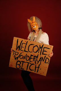
I feel this photo is the same too - though I do prefer the pose here.
This is one of the photos that I think really would confuse someone and it makes me question what I was actually thinking when planning this shoot. I think I planned it perfectly and could see clearly in my head what I was trying to achieve, but I just didn't execute it correctly.
All I can say about this photo, as with most of my other shots, is that I am standing in a bloody t-shirt holding a bloody cabbage whilst wearing a rabbit mask (that now looking at it, doesn't even really resemble a rabbit)!
Out of all of the shots I got, this is one of my more favoured ones as it I feel it is some people could make sense of kind of see where I was trying to go with this shoot.
I like the pose and lighting here, but I wish I had have gotten the entire sign in the shot.
What I am going to do next...
So this shoot really didn't go to plan at all! - but it has got me thinking as to why and what I could do better. To be honest I am rather annoyed with myself! But yeah, anyways, I think I am going to develop this shoot y using a different character and making it super dark and evil. I was thinking about using the Cheshire Cat character, but perhaps not even making it typically 'Wonderland' swayed and instead just focus on the dark side to an idea.
I have definitely have discovered from this shoot that I don't like shooting something that I haven't created myself e.g. wearing as mask instead of creating the entire look through makeup etc.
Plans for the shoot...
So, today's shoot I was inspired by the one and only Wonderland (yes, Alice).
It's a little different to what I normally go for in my work, but I love Alice in Wonderland and seems like a cool idea. I am planning on this time, rather than focusing on makeup, I will wear a rabbit mask and cover it in blood, and then wear a bloody t-shirt too. I am also wanting to hold a sign that syas "WELCOME TO WONDERLAND BITCH" as I want it to be dark and dangerous.
What I hope to achieve...
Out of today's shoot I really want to get a set of photos that show the dark side to Wonderland - like the dream has become a creepy nightmare. I want it to portray Wonderland as being a unsfae place filled with bad things rather than the typical chaotic madness that is seen in a light-hearted way - I think the rabbit is the perfect character to do this with as you think of the little white rabbit being all cute and innocent.
What I actually achieved...
Okay, so today's shoot didn't exactly turn out how I would have hoped - at the time I thought it was working out really well, but when looking at the photos after the shoot I have realised that contextually it doesn't really make much sense - it sort of just looks like I have thrown on a bloodly t-shirt and mask and stood with a sign and cabbage...
I definately HATED that I didn't do makeup for this shoot and instead wore a mask; it would have been better if I had have I think.
Well, here are some photos anyway...
Here is one of the photos that I though was a little bit better than most. I think here you can just about get the jist of where my insipration came from and some people will be able to see what I was trying to do.
I hate the colours here though, as with most of them. I thought the red would look best as a background as when originally I had a dark navy blue you couldn't see my legs and this made the photo look all weird - however, I don't think with the red/orange mask it looks right. The colours are all to similar and this doesn't do much for the over all effect.

I feel this photo is the same too - though I do prefer the pose here.
This is one of the photos that I think really would confuse someone and it makes me question what I was actually thinking when planning this shoot. I think I planned it perfectly and could see clearly in my head what I was trying to achieve, but I just didn't execute it correctly.
All I can say about this photo, as with most of my other shots, is that I am standing in a bloody t-shirt holding a bloody cabbage whilst wearing a rabbit mask (that now looking at it, doesn't even really resemble a rabbit)!
Out of all of the shots I got, this is one of my more favoured ones as it I feel it is some people could make sense of kind of see where I was trying to go with this shoot.
I like the pose and lighting here, but I wish I had have gotten the entire sign in the shot.
What I am going to do next...
So this shoot really didn't go to plan at all! - but it has got me thinking as to why and what I could do better. To be honest I am rather annoyed with myself! But yeah, anyways, I think I am going to develop this shoot y using a different character and making it super dark and evil. I was thinking about using the Cheshire Cat character, but perhaps not even making it typically 'Wonderland' swayed and instead just focus on the dark side to an idea.
I have definitely have discovered from this shoot that I don't like shooting something that I haven't created myself e.g. wearing as mask instead of creating the entire look through makeup etc.
Subscribe to:
Comments (Atom)


